So I had a brilliant idea after seeing ConCorp‘s logo in Hermitcraft Season 6.

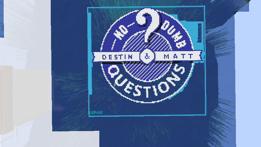
The NoDumbQuestions logo a la Minecraft.

Color
5-color is very difficult to make work on a flat surface. Dye-wise, we only have white, light blue, blue, cyan and black to work with.

As such, see the following from the wiki on map generation:
https://minecraft.gamepedia.com/Map#Map_content
Above water, the lightness of a pixel depends on its height. Below the water, details are visible down to 15 blocks as a shade of blue.
In this sense, consider using an ocean biome or flatten and fill in the area with water, then terraform. Terraform above the water with white wool. This should make things MUCH simpler.
5 colors:
White, Cyan, Blue, Dark Blue, Mid Grey
Notes about the NDQ Logo:
- Web Background: 2a7ebc
- Standard Blue: 00548b
- Shadow Blue: 083753
- Shadow White: 888281
- White: ffffff
If terraforming is too much of an effort, OTHER colors will work too when a block of that color is used: https://minecraft.gamepedia.com/File:Pumpkin_map.png
Blue, white, and grey alternatives to concrete:
Ice (all 3), prismarine, concrete powder, wool, shulker boxes, terracotta, stained glass, or carpet
Stuff to test:
- Differences of carpet, wool, concrete, concrete powder, lapis, diamond, prismarine, and shulker boxes at the same height on a map.
- Differences of concret at different heights on a map.
- Differences of any block underwater to a depth of 15 blocks on a map.
Size
As noted on https://minecraft.gamepedia.com/Map#Map_content, Minecraft map objects are always 128×128 pixels in size. The area which they cover, however, expands by an exponentsquare-base-2 exponent for each zoom level (, with each map pixel corresponding to a majority color in a square area.
- Z0 = 128×128 blocks, pixel = 1×1 block
- Z1 = 256×256 blocks, pixel = 2×2 square
- Z2 = 512×512 blocks, pixel = 4×4 square
- Z3 = 1024×1024 blocks, pixel = 8×8 square
- Z4 = 2048×2048 blocks, pixel = 16×16 square (1 chunk)
We obviously will have the best resolution in a 1024×1024 area (original image = 770×671). However Minecraft will scale this down to 128×128 in the end, which is the end version of what we want anyway. Besides, scaling down to 128×128 is going to be 64x less work. And we have more control over scaling when we use something more graphically robust like Photoshop.
It will be a LOT of work, but the most reliable method I see in creating a logo in Minecraft:
- Square logo and paste in web background.
- Convert PNG to transparent GIF – will reduce alpha channel to 1 bit from 8 bits.
- Change image mode to Local Selective Indexed Color with forced 5-color table. Note the grey artifacts in the white bands and around the edges.
- Resize GIF to 128×128, using bicubic sharper resampling (I found this setting with previous color pallete to be rather pointless – they all looked about the same).


Something to consider when I try alternatives: we know colors. All we want to define by resizing to 128×128 are edges. Note the broken “&” symbol. Note the thicker borders on the “?” mark. The jaggly “A” in “MATT”. What if we did the old Microsoft transparent=magenta trick and just picked completely bizarre, impossible-to-alias colors, then substitute the final colors in at the end??
It is possible we can make these adjustments in-game, but flying around, mining out a block and replacing it is going to be a huge hassle. It would be best done in Photoshop if we are limiting ourselves to any 5-color palette, particularly when getting rid of the artifacts and aliasing issues we see above.
HOWEVER, remember the above note that underwater will appear blue in 15 shades? Remember how colors get lighter the higher they are? What if we took the time and actually anti-aliased each block using the y-dimension? We can use a palette of white, light blue, blue, and cyan, or even just white, blue, and cyan, and then position each block vertically from 0 to 255 (or 5 to 255, since Bedrock would pose a problem, but would almost certainly appear black and very very dark blue in all cases)!
Are we going to too much trouble?
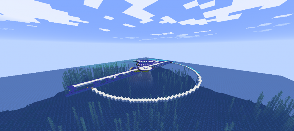
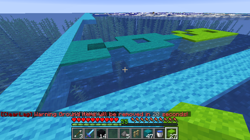
Now for the kicker: Cubfan135 showed us the ConCorp logo which he built flat, right on the water. He used the deep ocean (greater than 15-block-deep) water color as his background, which almost perfectly matches the medium blue of NDQ’s logo! And it was flat, wool pixelart. If cyan wool works at a certain height for our background, and we can block out a section of ocean to utilize the water in this manner, I see no reason to go too crazy trying to pencil in all the correct colors in photoshop. Just reduce (aka threshold) the thing to 2 color (blue and white), pixel-art the white bits above the water, drop in the cyan background (or use a higher-depth underwater block), then note the edge of the hard shadow beneath the ribbon and “?” mark and drop the height of the blocks accordingly.
Dynmap versus Map?
Glanced at the dynamic map of a server I run from work. I think that if we use the pixel art over water idea, this is going to be much easier than I initially thought.
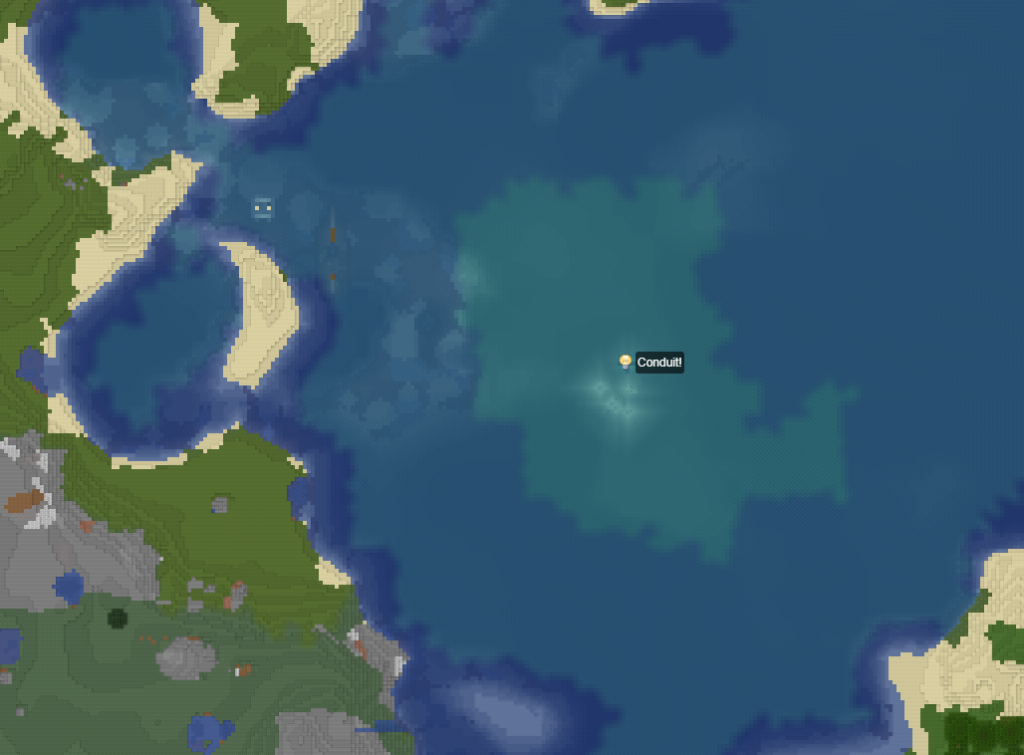
Note the shading of the “warm ocean” biomes is the teal/cyan we want for the Web Background color, where as colder or deeper starts going toward that Standard Blue we noted above. We could potentially pick one or the other and have some fun here. Assuming dynmap matches the coloring of an in-game map.
2019-11-30
Update!! I’ve started quite the sheep farm to get this logo thing going. And boy has it been super time consuming!
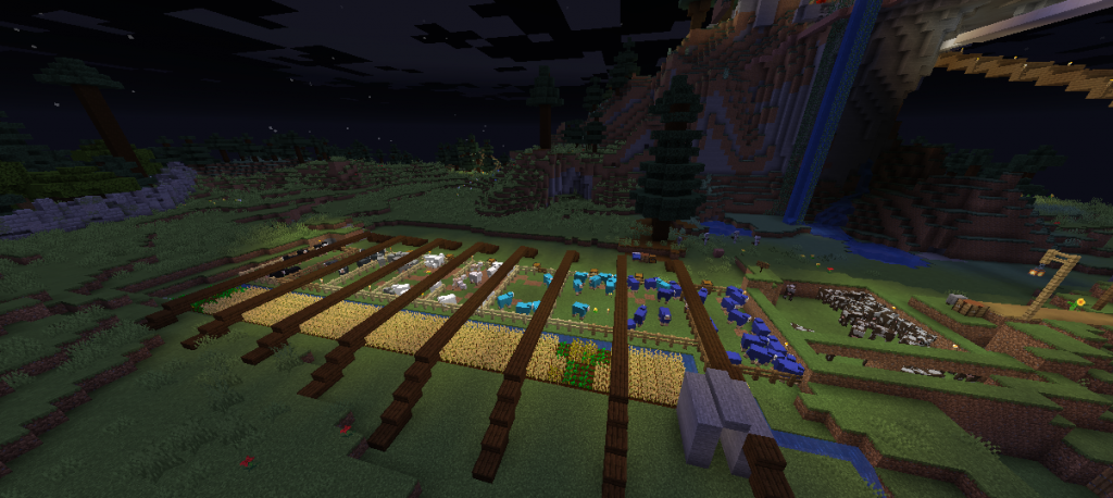
I started with a variety of colors, yellow and green being among them from old farms, but decided that if I was going to focus solely on the logo itself, blue, light blue and white would be the primary colors I’d need.
Then I found I needed dark blue, so I also created light grey, grey, and black since those were the only colors I could work with.
We are making a huge ton of progress. Additionally, the black, while not dark blue, actually works! Grey does not look as good in my opinion. I’ll be sticking with black for sure over the rest of the build.
2019-12-07
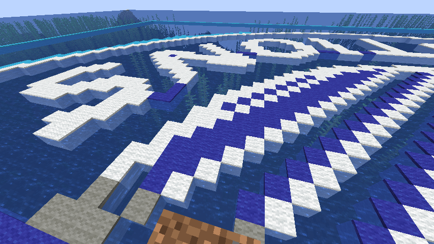
Between running between the sheep farm and the map area, going iron mining, and digging a strip mine all the way from the remote base to the main, during which I died and ClearLag wiped pretty much all of my good stuff, forcing me to waste a day and a half fishing, trading and re-enchanting all new equipment, I have made a TON of progress on the NDQ logo map.
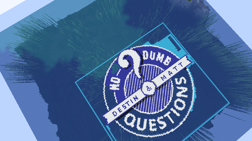
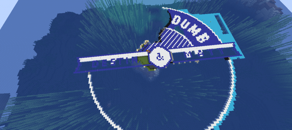
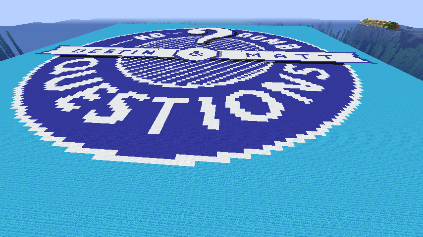
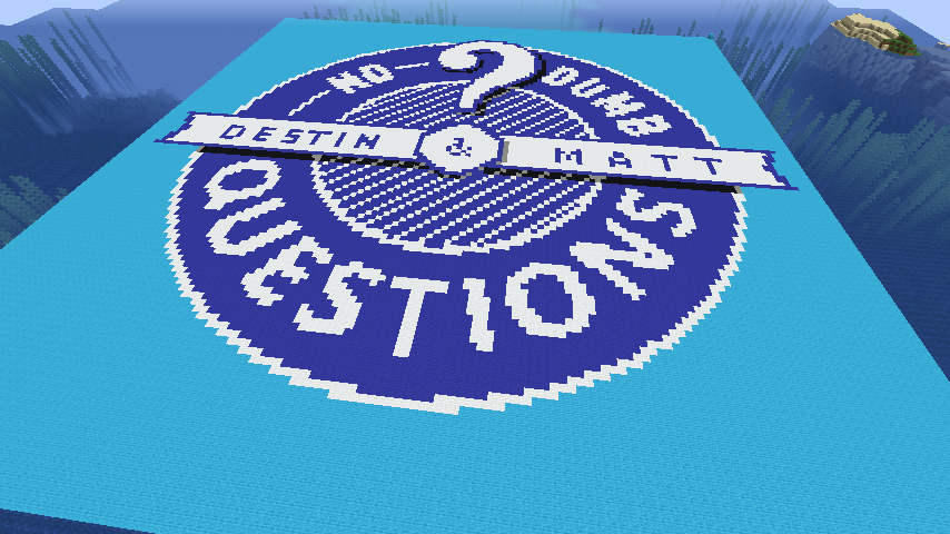
I am extremely impressed with how the shadow on the banner and question mark make the entire thing pop out. Even wandering around on the ground feels a bit trippy, as if I’ll run into something. The effect is astounding!
And of course, from the air it looks perfect.
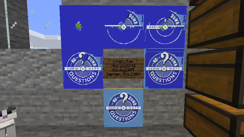
I know starting out I was stressing so hard about color gradients, and perfecting everything, and when Photoshop did its resampling, the output graphic which I have been using to trace the map pixel-by-pixel was pretty garbled. But I’ve been taking some creative license to modify upon it.
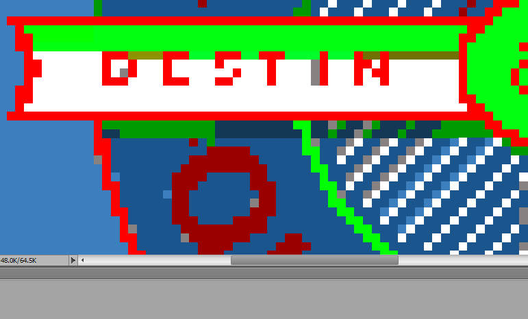
For example, Photoshop resized the logo to 128×128 and turned the banner lettering “DESTIN” and “MATT” into 4px high letters, which, for the “E” and “S” in Destin, simply did not work. I decided to make all of this lettering 5px high. If I saw this, I would never notice the alteration. In fact, it’s all more readable this way.
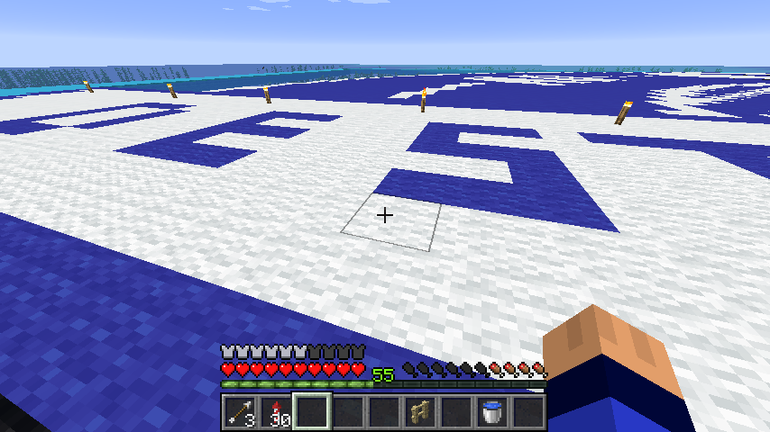
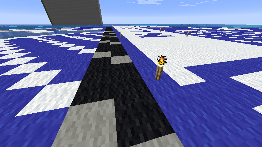
Of course, it took many trips back and forth to the sheep farm, and eventually I found that one group of white sheep was not enough, so I converted 4+ pens to white, leaving the blue and light blue while I harvested the remaining blocks I needed for all of this lettering
As soon as the last white block was placed, I started re-coloring all the sheep blue and light blue. Now it’s a complete mess, but very fast in harvesting. I’m burning through shears like crazy, which, in addition to trying to keep my beacon intact and trying not to steal iron from it, is resulting in a lot of mining sessions. It’s gives me quite a lot of iron to do so, but even so, when I see just how much iron block 2 stacks of ore will get me, I end up throwing that on the beacon also. Gotta get that 9×9 after all!
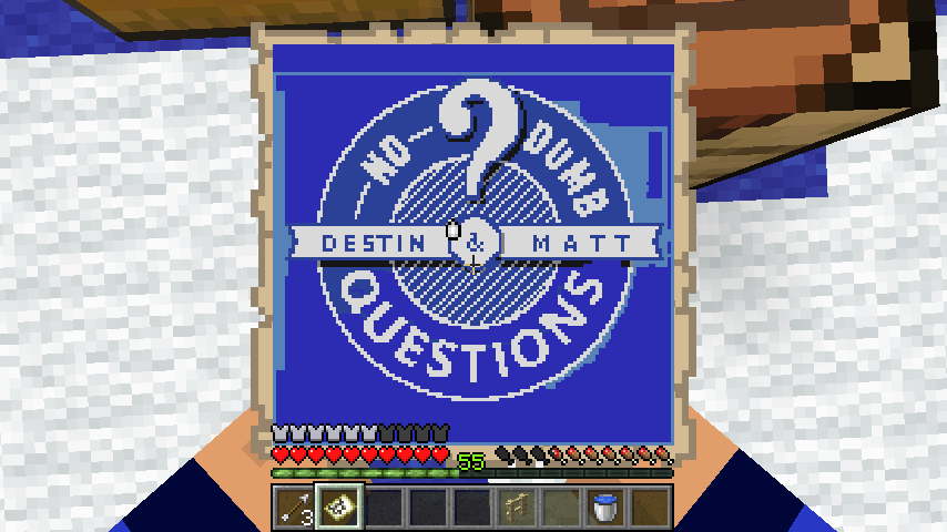
What’s this little cyan blorp in the corner, you ask? Well, I am not sure how subtle the contrast will be with light blue on the map itself, but this is my attempt at a signature. At 3px high, the characters DEP20 with no spacing makes an interesting, sort of runic thing, and I’m liking it a lot! I might use this elsewhere too.
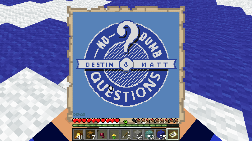
Without an item frame, the signature is covered by the hotbar, but in all, it looks like all I have left is just a massive blue/light blue grind before I’m totally complete on this!
Oh and the rest of the black beneath the right side of the banner. But that’s not hard.
FINALLY
02-21-2020 – Nothing like the threat of the apocalypse to motivate you to finish these projects.
NDQ Minecraft’s curator, mvoviri, put out today that while we have re-funded the server hosting, he wants to restart the world. A poll was held to choose:
- Keep the old world/don’t change anything.
- Reset the world, keeping the bar and the immediate area around it.
- Reset the world, keeping the bar.
- Reset the world from scratch.
Option 3 was chosen by a narrow margin over option 2 (which was my choice). So it was planned that on the 26th, the world would reset. Well, that was enough for me. My plan was to FINISH the logo, grab the latest copy of Litematica and get it working, and capture schematics for all of my stuff. Because my stuff is going to be deleted if I don’t, despite my pleas to have him bottle and offer the archived save folder for download to those of us who have put in so much time and effort on it.
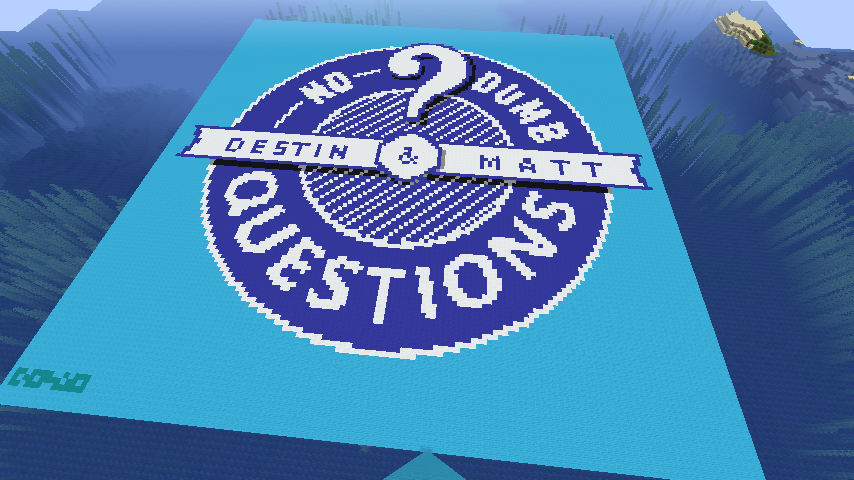
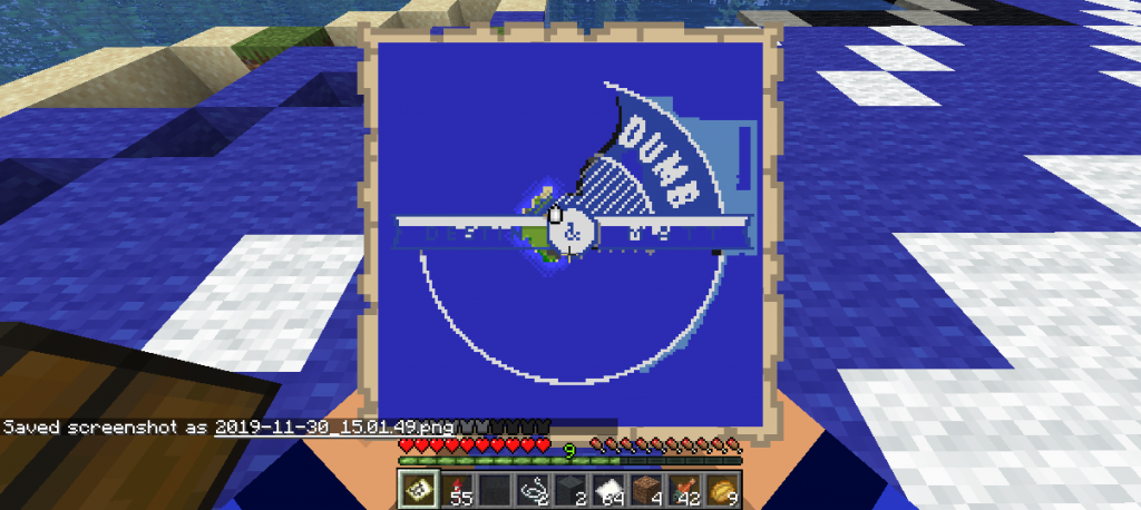
It’s DONE!
And three schematics were captured, last of which is our logo:
Hooray!! Finally, I can close this four-month-old post!
Leave a Reply